Why aren't interfaces fun anymore?
"We made the buttons on the screen look so good you'll want to lick them." — Steve Jobs
Let’s rip the band-aid off: most designers think their job is to move rectangles on a screen until it feels just right.
These designers are incorrect, IMO.
Because there’s something soul-crushing about enabling work to be limited by a singular type of shape that does not feel like the imagination of an artist. Of course not everything needs to become a Picasso painting, but can’t these “rectangular-bound-wireframes” be something better?
Something inspiring?
While I don’t know the exact reason why everything is boring, I do know a few ways we can change that,
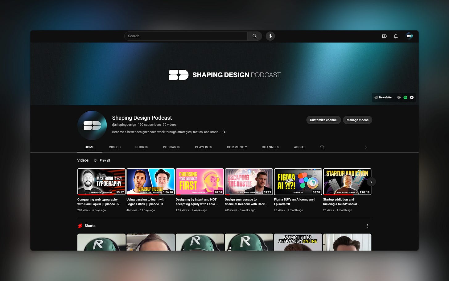
Before we continue, check out our interviews on YouTube where you can see me interview top-tier designers and hear their stories, strategies, and tactics to learn how to mimic their success.
Can we design things that are fun again?
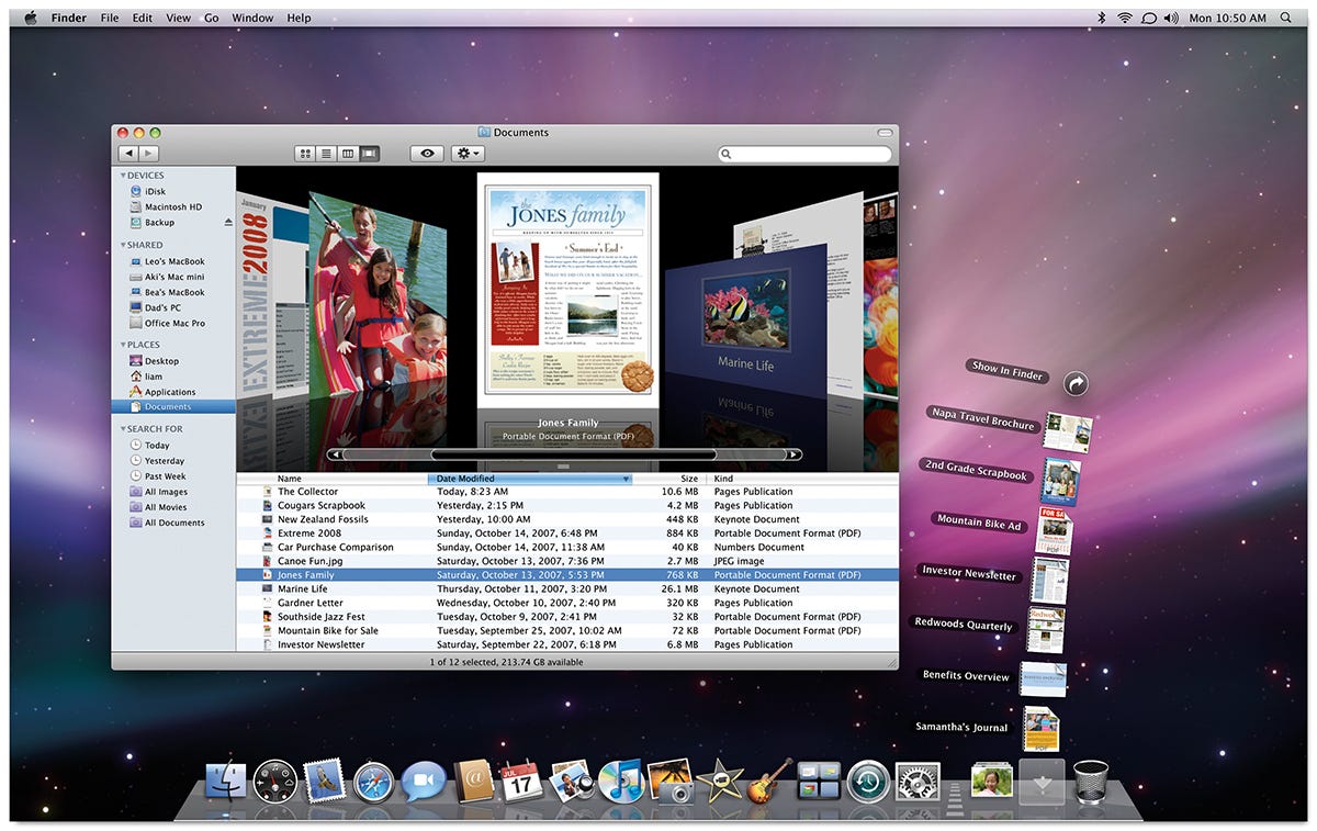
I remember getting my first iMac. Our neighbors had the white plastic desktop iMacs, and my dad (being the smartass he was) tried to one-up their purchase as a joke by getting the brand new metal iMac desktops.
With it, came an OS intro video (see below) that swept me off my feet.
Hot damn!
Nobody knew that this—this very video—would change my perspective of personal computers.
The care that went into every detail was like a dream. It made you feel special for joining the “in” group of a select few who could ever experience such a magical experience.
And, boy, was it magical.
Every bit of this OS was incredible. From full-on apps like Time Machine to details such as the expanding file cabinet of downloads.
Interfaces today ALL look the same right? You have people profile avatars on the top right, a share button next to that, with a sidebar menu on the left, all using the same plain of existence without much depth. Usually, these interfaces are surrounded by nothing but white white white, and do little to serve the users’ emotions vs. acting only on utility.
We have lost our way as designers and must find it back.
But how do we do it?
How to design fun interfaces again
There is a way out of this uninspiring world. It’s remedied in 4 parts:
Replace sources of inspiration
Draw from the real world
Reinvent the wheel
First, we must set aside much of what we usually deem as inspiration archives that were traditionally seen as safe—Dribbble, Behance, Creative Market, etc. Many of these sources do not include well-designed interfaces, they simply include a lot of work (they used to but whatev).
This can be great but sadly these sources are overwhelmingly stuffed to the point it’s impossible to feel inspired by the sheer ocean of copies, poor interface practices, and frankly lackluster self-promotional bodies of work.
Personally, I use private Pinterest boards since it has the largest volume of visually curatable content (but it’s still geared toward stay-at-home moms so…).
Then, we must draw out inspiration from the real world. Look at how materials interact with you as you use them. Metal can be reflective, ice can change when met with a warm touch, and paper bends and folds as you lift and force it in directions. All of these things react to us in different, meaningful ways that help us understand what we should expect from them.
Real-world experiences—these are to be cherished in an ever-growing digital replacement. We should capitalize on making these experiences more human, not less. Not only does it make a transition to the use of technology easier by mimicking expectations of the real world (or imaginative), but it also gives us a sense of joy that something so… boring and rectangular can embody a shining personality. Utility and fun? Sign me up.
Lastly, we must do the dirty deed of reinventing the wheel. Of course, utilitarians will reject this and say “if it ain’t broke…”. I’m calling on all designers up for the challenge to reinvent things that may seem minuscule but impactful.
Imagine if we could design things like Time Machine again. An imagination to do so would require somebody to think outside of the patterns of today to bring us back. Today’s interfaces are so stale and boring, with a sprinkle of focus on raising capital, and a drop of rushed and untested design systems… no wonder we feel are replacing ourselves with AI—to rid ourselves from enduring the pain of experiences these soulless rectangles!
If you wanted to kickstart your web design career, I highly recommend use try out the best no-code tool for creating your piece of the web: Framer
Get my first Framer template, 15% off using the code DOKSLAUNCH
A few that strayed
Some apps, regardless of what you think, have done a great job at trying to poke the bear to design things with a whimsical nature to them.
MacPaw’s CleanMyMac X is a great example of an app that feels like it’s breathing. Interactions are fluid, yet still intuitive. Animations, especially per holiday and on running the app, make it feel fun to use.
DaisyDisk is another app that uses beautiful visualizations to show you your computer’s storage broken down into parts.
It’s an excellent example of interactions that feel like they are natural.
Paper by 53 was an extraordinary app that used a notepad experience to draw you into using it (see what I did there?). You can see the app expects you to be creative by acting like the space of an existing creative, using colored notepads and natural gestures.
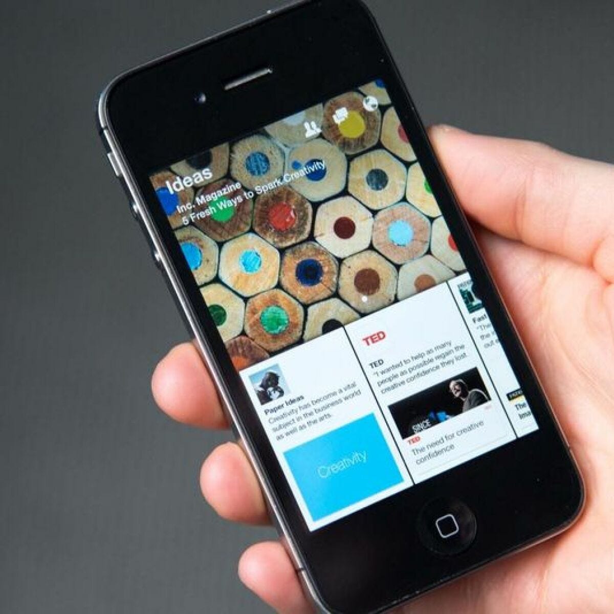
Paper by Facebook took interactions to the next level. Although this project died, its efforts were not in vain—Facebook took many interactions and lessons learned to add to their other core experiences.
We all learned a lot about fluidity and how it educates users so much more than a boring ol’ back button linear transition. It was like jello (some claimed to dislike) but that doesn’t mean it couldn’t have been tweaked to be just right. It was probably my favorite mobile experience that took physics to a new level.
That’s all for this week! Hope you enjoyed it! If ya did (or didn’t), send me an email or comment on this on Substack.


