

Here's what you'll learn:
Design systems are often misunderstood
The success or failure depends on various factors
Not meant to limit creativity or lead to monotonous outcomes
and much more…
Let’s dive in…
There seems to be this heated debate in the Internet world on design systems. Some advocate for them while others just dislike them. The likes of Adobe, Google, and IBM have built robust design systems in order to save time, minimize rework, and reuse components that would otherwise require the investment of time and resources yet many designers argue that they just suck. 🤔
Personally, I’m tired of the same old arguments from most designers… stating that design systems stop creativity or that they are limiting.
Design systems are not the enemy of creativity; rather, they empower designers to channel their creative energy more effectively.
If you understand how to leverage design systems that is.
Everybody loves a template and Figma components.
Are they efficient? Yes.
Are they the most boring thing on earth? They could be yes(ish).
It is the responsibility of designers to educate themselves on design systems and explore their possibilities fully.
Let’s unpack design systems.
Why design systems fail
Adopting a design system requires a change of mindset. Creating a successful Design System is challenging because it requires people with different disciplines to work together as a team. This ain’t a solo sport friends.
“We need teams of missionaries, not teams of mercenaries” — John Doerr, author of ‘Measure what matters’.
The most important output of systems is rarely the design itself. Rather, it’s about bridging the gap around design intent. That’s the value of using systems as a tool for business alignment.
A majority of design systems ended up imploding. According to the 2021 Design Systems Survey, only 40% of the systems were successful. Why do some design systems succeed when most fail? WTF is the problem?
The first roadblock to overcome is a change of mindset. In companies where the value of designing at scale isn’t fully understood, concepts like collaboration, consistency, and unified experiences are rarely well implemented.
In 2023 a brand can’t afford to not provide a unified experience. Customer interaction must be intuitive and seamless across devices.
All teams, both product, and marketing, need to start acknowledging the idea of uniting their effort under one experience, whatever it takes.
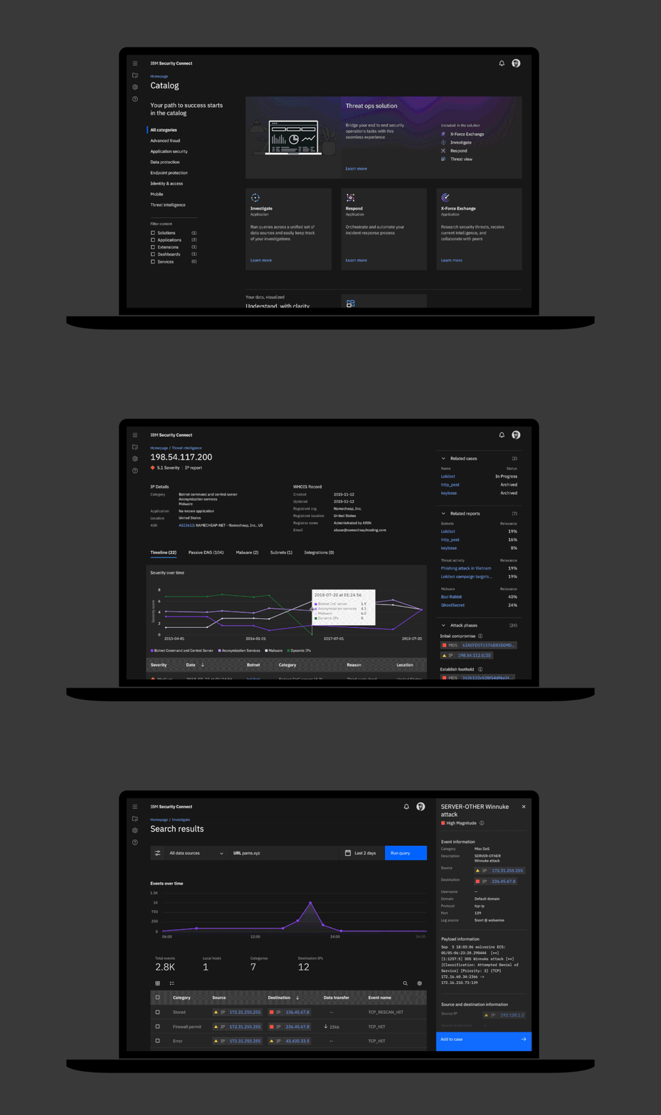
From working with some of the biggest design systems in the world, the list of why design systems fail is actually really long but we’ve identified some of our top issues:
Lack of adaptability
Overemphasis on visual consistency
Synchronization & Teamwork
Maintenance
Lack of user-centric approach
Insufficient collaboration and communication
Lack of iteration and evolution
Design systems go stale fast
etc.
Each screen isn’t a special snowflake
Stop reinventing the wheel every single time. Just stop. Remember that everything you design is much bigger than that small feature and that it is part of a big, interconnected system.
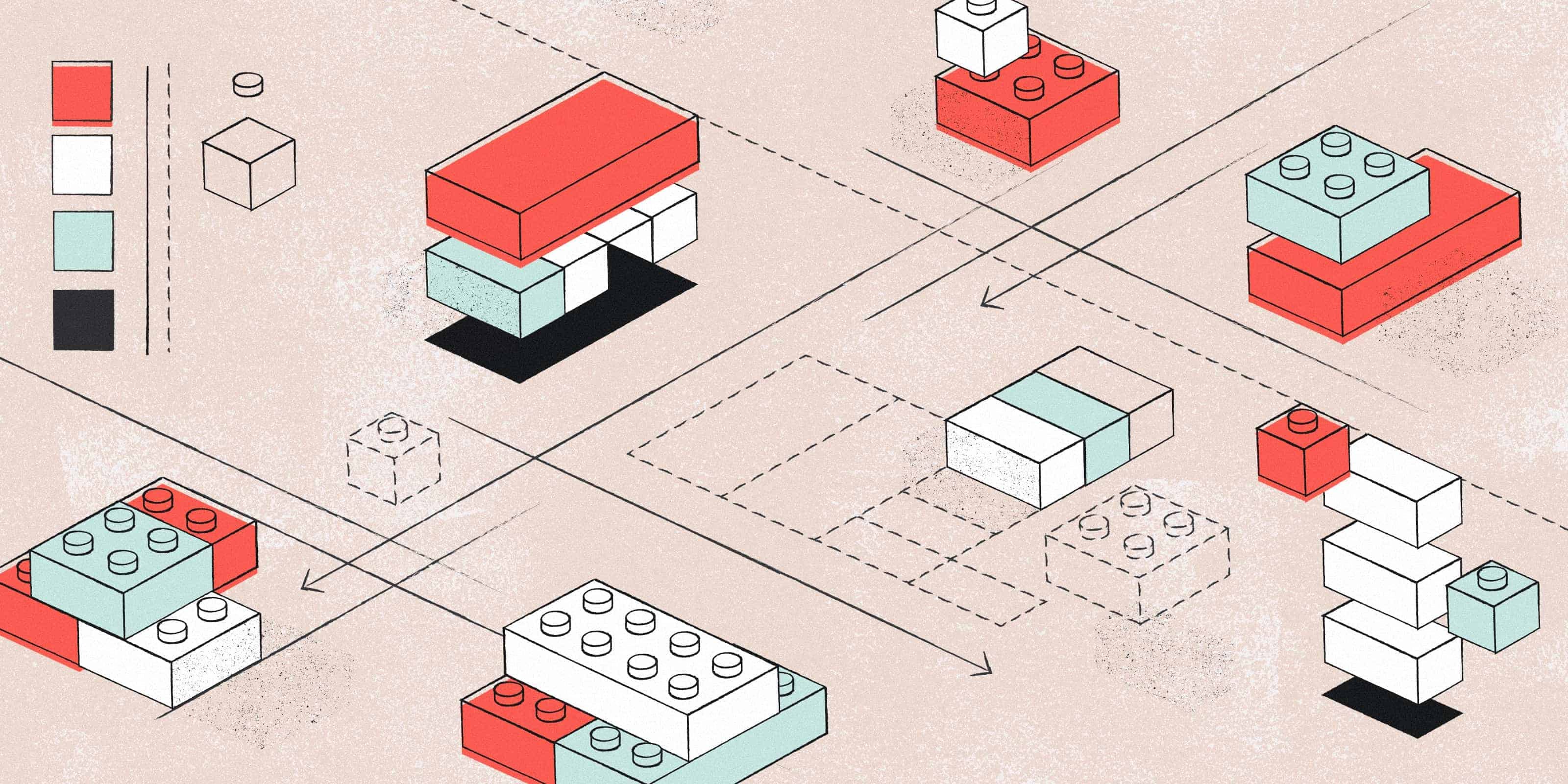
Why do designers reinvent the wheel every time they open up Figma? Yes, we are all creative but there is always a place and time for this. No, you don’t need to change the button size for your “special use case”. You, yes you, need to become as creative as you can be with the Lego blocks you have.
This is a car built with Lego blocks.

This is also a car built with Lego blocks.

Both cars have been built using Lego blocks yet, one is way more stunning than the other. What’s the difference? One of these used the Lego blocks as the floor and not the ceiling. He used the blocks to push the boundaries… flexing and molding them to achieve something fascinating.
To solve these complex ecosystems, design systems were born.
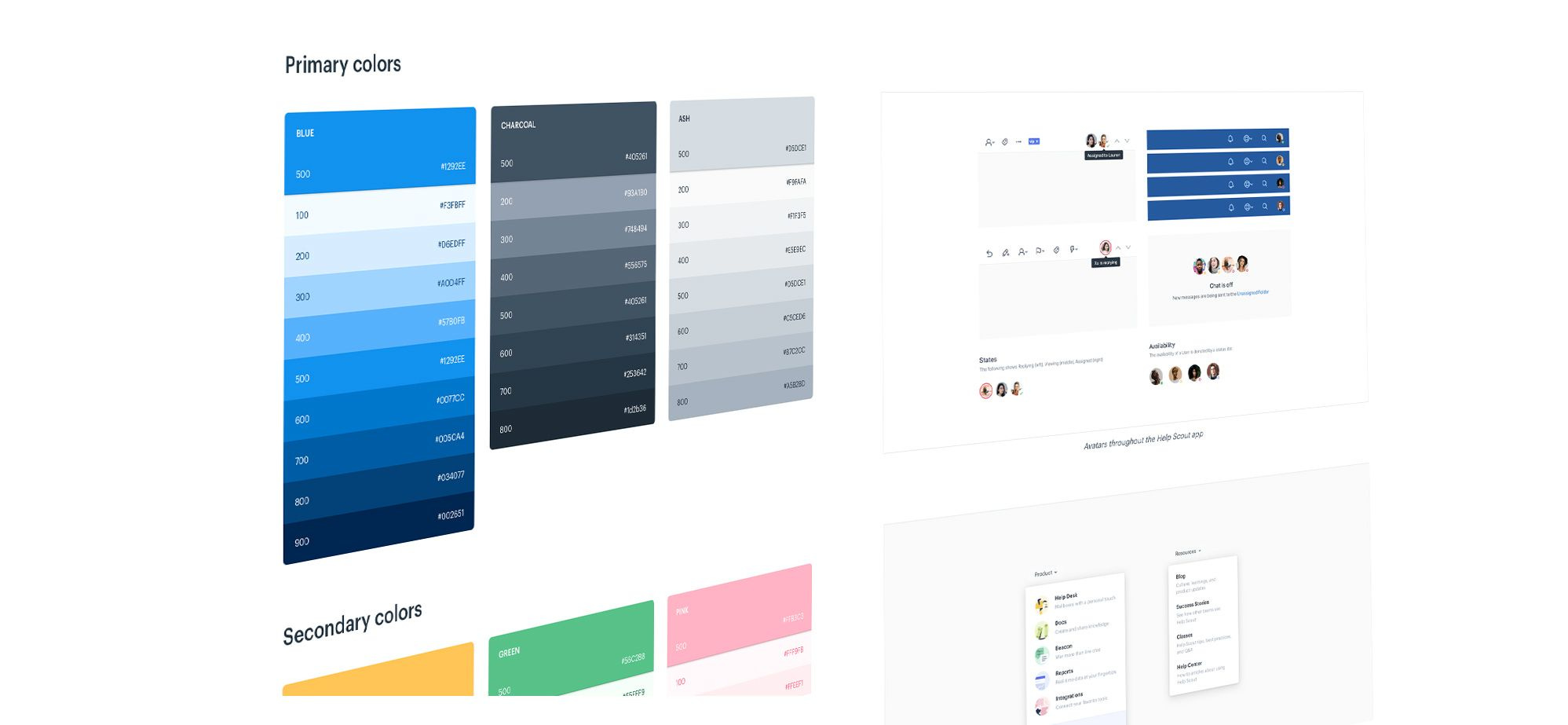
A design system is a “collection of reusable functional elements–components and patterns–guided by clear standards that product teams use to create a consistent experience across a range of products.”
Change of mindset
While resistance to change is understandable, the reluctance to embrace design systems in the field of design is hindering progress and stifling true innovation.
No. I don’t think design systems are required for every single product out there but, I think it's time for designers to change their mindsets, step out of their comfort zones, and embark on a journey of design innovation through the power of design systems.
No, you won’t lose your creative freedom
Breaking the silo mentality
Seeing the 100-foot view of things
Designers like to be creative (often not on the right element)
This redundancy leads to inefficiency, wasted effort, and inconsistent user experiences. By eliminating repetitive work, designers can allocate more time to innovation, experimentation, and refining their craft.
The facts
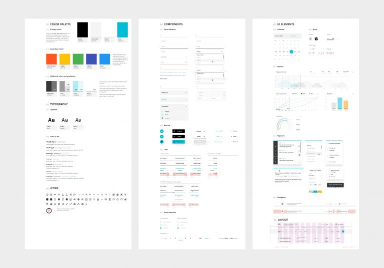
A design system is more than a library
The what = the library
The how = the documentation (how is this supposed to work and be used)
The why = what led to the status quo
A design system is just a tool
Don’t mistakenly assume that having a good design system automatically guarantees design quality. Your design system is merely a foundation—a tool that aids in getting started and accelerating the design process.
A design system won’t make you a good designer.
A design system is always incomplete
Defining the foundations is the first step of the process, and just like a house, it is crucial to have solid foundations if you don’t want the system to collapse later on. A design system is never actually complete. It will evolve with your product’s requirements.
It’s ok to break the system, as long as you’re doing it with intent and everybody owns the system. We will dive into this in our next article
Design systems are…
Design systems bring many advantages to products and designers.
They help with consistency, so there are fewer unique solutions for similar problems.
They make design and development faster.
They free designers and developers to focus on bigger, and more specific, problems.
At least, that’s the theory…
In practice, often suffer from misinterpretation, creating an unfavorable environment for achieving optimal design results. This occurs due to the following reasons:
Consistency becomes monotony and we lack variety and intent in our solutions.
Speed is overrated and the momentum hinders teams from building outside the bounds of the system.
Designers and developers become imprisoned within the system's boundaries.
❌ Many designers see a design system as the ceiling. They think they can’t flex and mold a system to create compelling and engaging designs.
Does that mean we should burn our design systems?
Heck no! It just means that in order to reap the benefits of a design system, we need to tweak our perception, and the way we build and use them.
What can we do?
Be consistent and intentional: Being consistent doesn’t mean everything needs to be the same. Keep being a designer, not a line assembly worker.
Measure more than speed: We should advocate spending a bit more time to ship a product with a better design, making a case for the value it brings to the table.
Don’t settle: Consistently thinking ahead. Always. Design is never done and the same applies to your design system. Designers need to be proactive, not reactive.
Unity, not conformity: Design systems are not intended to stifle creativity or result in monotonous outcomes. On the contrary, they provide a framework that empowers designers to create engaging, innovative, and visually captivating designs.
Design systems are intended to speed up your work so that you may focus on more important design decisions. In this article, it is reported that participants had access to a design system they completed their objective 34% faster than without a design system.
Final words
There will never be a one size fits all approach. It's crucial to approach the development of a design system strategically, considering the broader context and needs of the project or organization.
Design systems provide a structured framework for creating consistent and cohesive user experiences. A well-crafted Design system does not restrict creativity; rather, it empowers designers to focus on higher-level creative decisions.
Organizations can overcome the common pitfalls of design systems and create a system that aligns teams, enhances efficiency, and ensures everyone remains up-to-date.
If it is well crafted and well-implemented it will have the potential to transform the way teams collaborate and produce exceptional design outcomes.
Until next time,
Pascal & Mitchell
Hey, Mitchell & Pascal here! Thanks for checking out this week’s free edition of the Shaping Design newsletter. We strive to send you the best tips and our very own unique perspective each week. Subscribe to get each article!
If you enjoy this newsletter, we’d love to know!